Learning how to read a BNB price chart can feel overwhelming at first, especially if you’re new to cryptocurrency trading. But just like reading a map, understanding a chart becomes second nature with some guidance and practice. Whether you’re a casual investor or an active trader, knowing how to interpret a Binance Coin (BNB) chart can give you a significant edge. It helps you make informed decisions rather than relying on emotion or hype.
A price chart tells the story of an asset’s performance over time. For BNB, which is traded across multiple exchanges, the most accessible chart is usually found on platforms like Binance itself or on widely used analysis sites like TradingView. When you open a BNB graph, you’ll usually see a line or candlestick chart by default. Each point or candle represents price activity within a given time frame, which can range from one minute to one month or more.
To read a BNB chart like a pro, you should start by choosing the right time frame. Shorter time frames like 1-minute or 5-minute charts are useful for day traders looking to make quick trades. Longer time frames like daily or weekly charts are better for swing traders or long-term investors. This helps filter out noise and focus on broader trends. The same asset can look bullish on one chart and bearish on another, depending on the time window.
One of the most common chart types is the candlestick chart. Each candle shows four key pieces of data: the opening price, the highest price, the lowest price, and the closing price during that time frame. A green candle typically means the price went up, while a red candle shows a decline. Long wicks on either side of the candle suggest volatility, indicating that the price fluctuated widely before settling.
Another important concept is support and resistance. Support is a price level where the asset tends to stop falling and starts bouncing back. Resistance is the opposite — a level where the price struggles to move higher. These levels are psychological as much as technical and often indicate where traders might take profit or open new positions. By identifying them on a BNB graph, you can better anticipate potential turning points in price action.
Indicators are tools that help analyze trends and momentum. For BNB chart analysis, two of the most popular are the Moving Average (MA) and the Relative Strength Index (RSI). A moving average smooths out price data over a set period, helping identify the general direction of the trend. The RSI, on the other hand, measures the speed and change of price movements to identify overbought or oversold conditions. An RSI above 70 often means BNB might be overbought, while an RSI below 30 suggests it could be oversold.
Volume is another key part of reading a BNB chart. It shows how many tokens are being traded in a given time frame. High volume usually confirms the strength of a price move, while low volume might signal weakness or lack of conviction. If BNB breaks through resistance on high volume, the move is more likely to be sustained than if it happens on low volume.
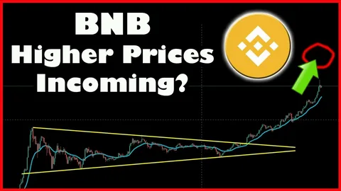
Trend lines and chart patterns can also be helpful. Drawing a trend line involves connecting at least two higher lows in an uptrend or lower highs in a downtrend. Patterns like triangles, flags, or head-and-shoulders formations often precede major price movements and are widely used in technical analysis.
While no chart is a crystal ball, mastering how to read the BNB graph gives you a much better chance of making smart trades. It enables you to time your entries and exits more effectively and manage your risk with greater confidence. It also helps you stay calm during volatile swings — because you’re guided by data, not just instinct.
Like any skill, chart reading improves over time. Start with the basics, review your trades, and refine your strategies. Whether you’re analyzing BNB to find the next breakout or simply to understand the market’s pulse, becoming fluent in chart language is a valuable tool in your crypto journey.


